Pages

Showing posts with label Masculine Card. Show all posts

Masculine Holiday Holly Card


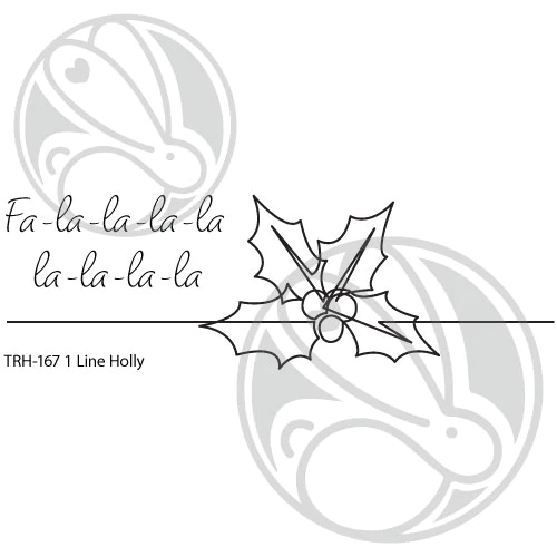
Hello! It's Lauren here sharing a slightly mixed media holiday card using the 1 Line Holly stamp set. This is a really versatile set for creating beautiful cards with.

To create this card, I started by adhering this Christmas music tissue paper that I had in my stash. You can also use any patterned tissue paper or plain tissue paper for a cleaner look. I then applied a thin layer of collage medium (you can use mod podge or also clear gesso) to a 4.25 x 5.5" piece of bristol smooth cardstock. I laid the tissue paper on top and then applied another thin layer of collage medium over top. It is ok to have the tissue paper crumple and/or fold when you apply it. Then I set it aside to dry.

When the panel was dry, I trimmed of any tissue paper that was hanging over the edges of the panel. Then I stamped my Holly Line and sentiment in black ink onto the panel. 


I used a heat gun to make sure my ink was dry before coloring it with metallic gold watercolor. 


Once the gold watercolor was dry. I trimmed the panel down slightly and adhered it onto a black panel measuring 4.23x5.48". Then adhered that onto a white top folding A2 (4.45x5.5") card base.


I really love how this turned out. I would make a great masculine card and would go through the mail easily.

I hope this has inspired you to give this technique a try with your 1 Line Holly stamp. Thanks for visiting! 

Here's a link to the 1 Line Holly Stamp set:
1 Line Holly 2x6 – The Rabbit Hole Designs

Thanks again for visiting. You can follow me here:


Masculine Sympathy Card

 Welcome to today's The Rabbit Hole Designs blog. We all know creating masculine cards can be a challenge.  It can even become more challenging when it is also a theme specific card, like a sympathy card.

This card uses the new Hold My Flowers stamp set (illustrated by Tatsiana Zayats).  As I mentioned in a previous blog, this is my new go to set for sympathy cards and get-well cards. I love the images and the sentiments they are simple and heartfelt.

 It is easier to create and color joyful flowers, but sometimes, it is more appropriate to tone down the image. Here is my solution to for this instance.

My focus starts with a printed brown plaid cardstock I have chosen to use as the background. The muted color is the inspiration for my color theme. 

The image is stamped in a black ink and first colored using Copic markers in a brown-gray scale with no color added.  The added color is created using colored pencils over top of the grey scale image using light pressure.  This technique similar to early photograph portrait color tinting. My grandfather was a portrait photographer. He used this technique.  All of my baby portraits are hand tinted by my Grandpa George (aka - Gramps and Bumpa)

I treated the lower righthand side of plaid print cardstock with the Cottontail Embossing Powder Tool.  This will create a barrier that discourages the embossing powder from stick to your cardstock.  It will only adhere to where you stamp the image leaving you a crisp and clean sentiment.  I stamped the sentiment with VersaMark Watermark clear ink. I added a fine white embossing powder and heat set the sentiment.
Here is a tip I think will help when you need to create a masculine card. Always keep masculine style printed paper and cardstock in your stash.  It does not need to be a large amount of paper, maybe one 6x6 or 12x12 printed pack. This gives you a go print for your masculine inspiration and creations.

TRHD Products Used

I hope you enjoyed learning a bit about portrait color tinting and how to apply the technique to your stamped images to create masculine cards.

Hold My Flower stamp and coordinating die sets are part of The Rabbit Hole Designs new April Release.

Be Creative ~ Stay Inspired

Jenn Gross


Follow me, Journey Coach Jenn, on 

Instagram - https://www.instagram.com/journeycoachjenn/

YouTube - http://www.youtube.com/c/JourneyCoachJenn

Blog - http://www.journeycoachjenn.com/


For more inspiration, updates, and news make sure to check out these places


The Rabbit Hole Designs

The Rabbit Hole Designs Instagram

The Rabbit Hole Designs Facebook Page

The Rabbit Hole Designs Pinterest

The Rabbit Hole Designs YouTube


Monochromatic Chubby Unicorn


Hiya! It's Lauren on the blog today with this fun monochromatic masculine card using the new Chainmail stencil and Caffeinated Rhino stamp set. This rhino looks exactly like my husband in the morning except my husband has brown eyes!

To create the stenciled chainmail background, I blended Black Soot distressed oxide ink onto a silver shimmer cardstock panel (A2 sized). I trimmed it a bit so it was just under 4.25x5.5, adhered it to a dark grey A2 sized background then mounted that onto an A2 top folding card base.


Then using black ink, I stamped the rhino onto gray cardstock. I colored him using Prismacolor pencils then fussy cut him out ( the coordinating die is now available!).
The colors I used were:
Rhino: French Grey, 10%, 20% and 50%
Boxers: White, and Lemon Yellow
Mug: White
Eye: White, Blue Denim, Cerulean Blue, Indigo blue


After coloring the boxers, I used my Versamark pen to go over each star and covered them with glow-in-the-dark embossing powder. Then I heat set the powder. Then I placed him onto the card using double sided foam tape.


Using black ink, I stamped the sentiment onto the same silver shimmer paper. Then trimmed it using a rectangular die and adhered it onto a dark grey stitched banner I had cut out. I adhered it onto the card above the rhino. To give the card a more polished look, I placed a silver self adhesive "rivet" onto the banner before and after the sentiment.


That completes my card. I hope you enjoy my chubby unicorn. Thanks for visiting!

For more inspiration, updates, and news make sure to check out these fantastic places! 

Clean, Simple, Masculine...


Why are masculine cards so hard? Is it just me, or are clean and simple cards hard too? It's never that they take a lot of work; it's just that the ideas are hard to come up with. And it's hard to know the difference between clean and simple, versus plain and boring, right? Amanda from Pear Blossom Press here again, and today, I'm sharing a two versions of a clean and simple, masculine card. Since I already took care of the hard part (coming up with the idea), you're going to love how fast you can whip up a whole batch of these to have on hand!

STEP ONE:

Stamp HAPPY BIRTHDAY from the Marquee Words set onto a white panel. Turn the exclamation point upside down and stamp the bottom portion of it (mask off the top of the dot) above the words. Move it over and stamp it two more times. Next, use a Copic Multiliner and draw the top of the dot to look like a candle flame.  

STEP TWO:

Color the dots and flames with Copic markers. I used shades of green for one card, and blue greens for the second. Next, I trimmed the panels down to 5" x 3¾" and added a raised border, by scoring 1/8" on all four sides of the panels in my Scor-Pal. At this point, you can pop the panels up with fun foam on black mats and white card bases. (That's what I did for the green card.) But if you want to spend a few more minutes on the cards, you can add lights to the flames with EZ-Lights. They'll add a real pop of light! To do that, you'll want to punch a small hole at the base of each candle flame. And if you look closely, you'll see that I embossed PUSH HERE next to the Y in happy. I used white powder to allow it to blend into the background. In person, you can see the raised, shiny text, but it doesn't detract from the clean layout. 

STEP THREE:

Add lights! Flip your panel over and use double-stick tape to adhere the battery of your EZ-Light to the panel, making sure to line up the button right under PUSH HERE on the other side. Line up the three LEDs with the holes in the candles and secure them with tape. Add a layer of double-thick foam tape around the edges of the panel. I promise, it's really simple. Then you can attach it to the black mat and card base.

STEP FOUR:

Add clear raindrop gems on top of the flames. I did this on both cards; they're a great detail whether or not they light up. In the pictures below, you can see how the entire gem will light up when you put it on top of a light. You can also see what it would look like if you don't cover up the light... 

That's it. Pretty easy, right? Obviously, you can change up the colors, or even stamp on colored cardstock and fill in the dots with a white gel pen if you want a different look. Adding the lights only takes a few more minutes, but the card is great without them too. Here is a look at the finished cards. (The green doesn't have lights, the teal does.)

And here is a closeup of the lights, after the glue is dry. (Make sure to use a glue that will dry clear.) See how the whole gem lights up, instead of just the bottom of the flame? Pretty cool, right? You can use this same trick for other gems too, as long as they are clear or translucent (no silver paint on the back). 

What do you think of my clean and simple, masculine cards? I hope I've inspired you to give them a try. Want to see another card made using the Marquee Words stamp set? Check this out. How about another card with gems that are lit up? This Christmas card has lights under the star and Rudolph's red nose.

Thanks for stopping by today! Head on over to my blog, to read the sister article and find links to the specific products I used for today's cards. If you give this a try, tag me on social media so I can see and cheer you on! I'll be back soon with more fun cards to share. 


From OWL Of Us Card

Hey Everyone! Justin here, and today I'm sharing this fun creation using the new OWL-Right set, part of the Rabbit Hole Designs' March 2020 Release!

This little bunch of owl are so stinking cute, and I love that the possible color palettes to color them up are just endless. For today's card, I decided to throw a masculine color palette on them. Now, for me, this color palette could really be for anybody. When I create something that I want to give to a guy, I just make sure to not use any overly feminine themes.

First, I cut out a 4.125" x 5.375 panel and stamped my group of owls from OWL-Right in the lower center of the card. I colored the owls up using a red, denim and neutral gray color palette with my alcohol markers. Each owl only uses a 3 color blend for their feathers. Then I went in and added some details, such as a warm gray shadow underneath the lower row of owls, and light blue eyes for all of them that wash out to white towards the end.

Next, I wanted to use the set's sentiment "From OWL of us", because you can really use it for so many occasions: birthday, anniversary, retirement, congratulations, etc. However, I wanted to also use the Spell It Stencil to spell out "OWL" since I knew I would have the space. So, I lined up where my sentiment would fit, and carefully blended my O, W & L in red ink with a blending brush.

Tip for the Spell It Stencil: I'm sure that you've seen a lot of the Design Team and Rabbit Hole Crafters use the Spell It Stencil to spell things out on their projects, and one of the reasons why is that it is incredibly easy to do! Because the stencil is structured where each of the letters is broken into horizontal rows of lines, it's so easy to make sure that your letters are all lining up and not "wonky". For this card, I actually blended my "W" first, just to make sure it was centered. I then went in with my "O", finishing with my "L".

For the rest of my sentiment, I stamped out "From" and "of us" onto a navy blue strip of cardstock and heat embossed it with white powder. I cut the strips into small segments and mounted them to the card with foam tape.

To finish this card off, I adhered my white panel to an A2-sized navy cardstock panel, applied some red accents, let them dry, and mounted the card to an A2-sized card base!

Products Used in this Project:


For more inspiration with your The Rabbit Hole Designs Creations, be sure to follow along at these other locations:


For more details about products used in this post, you may also follow along at my personal blog, Just a Note by Justin, as well!

There are so many things to love about this new release, especially these adorable owls! I hope this card sparked some ideas and inspiration for your next project!

Doggone Birthday


Hey crafty friends, it's Amanda from Pear Blossom Press again! Have you seen the new Doggone and Cattitude sets yet? The cats and dogs are cute, but not too cutsey, so you can make masculine cards with them as well. And I love that the sentiments are interchangeable. For today's card, I combined one of the Doggone dogs with a sentiment from Cattitude for a punny birthday card.

To make this card, I stamped, embossed, and Copic colored my dog and a bunch of bones. Then, I cut them out with my ScanNCut. Next I die cut my scene pieces - the trees, clouds, and hillside borders. The shorter, front hillside border was partially cut with a grass border, then a curved hillside border so that it looks like the grass drops off into a hole. I stamped, embossed, and Copic colored more bones on the back hillside layer. Then I coated them with masking fluid so I could ink blend on top of them.


I used makeup brushes to ink blend a cloudy sky onto a 4" x 5¼" panel. I also blended color onto the die cut pieces. I blended green into brown on the hillside pieces, around the bones, to look like a hole had been dug through the grass. Then I removed the masking fluid from the bones. I stamped and embossed the sentiment on the front hillside layer. I glued the trees and back hillside to the cloud panel and popped the front hillside, dog, and clouds up with foam tape. Then, I glued some of the cut out bones on top of the other bones and popped a few more up with foam tape. I added a few details with a white Posca pen in the grass and trees. I plan to give this card to my dad, so I didn't add any glitter or sequins. To finish the card, I popped the panel up onto a green A2 card base with a thin layer of fun foam and I stamped and embossed a pair of bones onto a coordinating envelope, just to hint at what's inside.


Thanks for stopping by today! I hope I've inspired you to make a punny card of your own. Make sure to check out Yippee! and Cattitude for more inspiration with these stamp sets, and for a discount code that's still good until tomorrow (details in the links). You can find the sister article to this on my blog. I'll be back soon with another fun card, so make sure you're signed up for the newsletter so you don't miss it!