
Hello my friend. It's Amanda from Pear Blossom Press again. I'm back with a lovely card that focuses on faster coloring with Copic Markers. I finally feel like I'm starting to get a better handle on how alcohol markers work, and what results I can expect. And I'm getting over my fears when it comes to blending. The more I work with them, the less afraid I am to grab markers with big jumps between the colors.
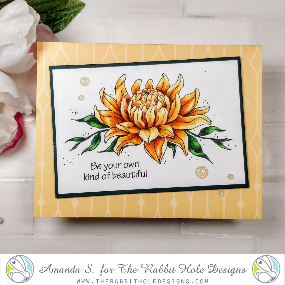
For today's card, I stamped the flower from Turtle Botanical in black ink, masked it off, and stamped a leaf cluster from Pretty in Peony on either side. Then I got to coloring. You can see all of the colors I used here...
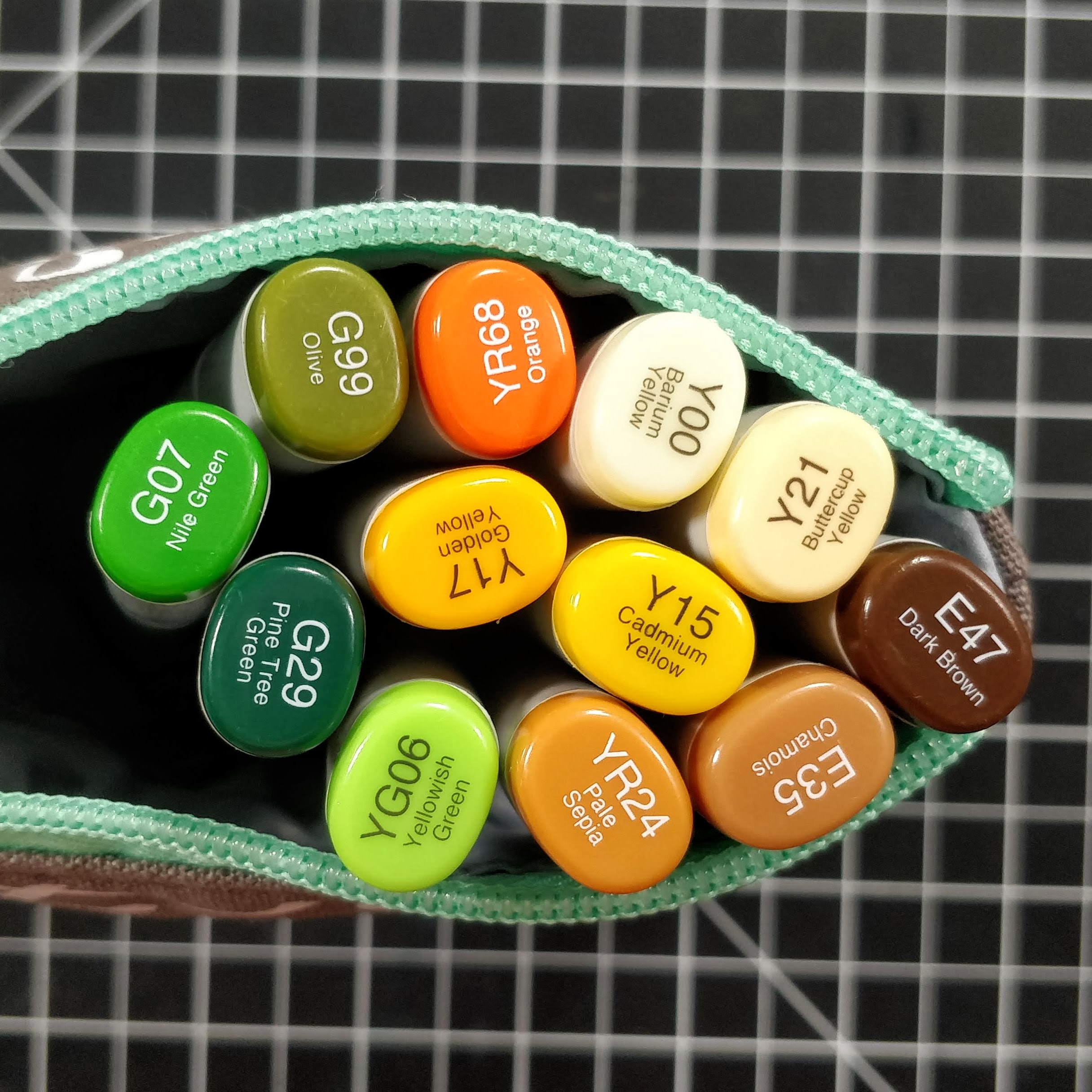
I knew I wanted a yellow flower, and at first, I thought the YR68 would be dark enough for my shadows. I mapped them out in the bases of most pedals, skipping some here and there so they wouldn't all blend into one big pedal. Then I went through the yellows, getting lighter. I even left some white spots as highlights on many of the pedals. Usually, I would switch to colored pencils at that point, to darken up the nooks and crannies. But I decided to be bold and dig into the shadows with brown markers. I added some E35, and then E47. It was so much faster than pencils! Now I'll admit, it's not as controlled either, but if you take the caps off both sides of your pens, and use a very light touch, you can get pretty fine lines. So for my yellow flower, I ended up using eight colors, ranging from dark brown, to pale yellow. And don't forget, I left white space too. That's a big jump.
For the leaves, I used four colors. The G99 wasn't going to be dark enough, but I wanted the olive tones. So I colored the shadows with G29, then glazed over them with the G99 for a dark olive. I used G07 as the mid-tone, and YG06 as my highlight color. I've noticed that the smaller the area you have to color, the bigger the jump you want between light and dark. Otherwise, you won't notice the difference. To help ground the flower without adding a drop shadow, I added tiny green dots all around. Again, remove both caps for smaller dots. This trick can save you a bunch of time. Have you ever started coloring a shadow around your image, and next thing you know, you're chasing the color out so far, you feel like you just have to color the whole background? Dots can help. Add more toward the bottom, and they'll be a faux ground; no shadow needed.
To pull the card together, I put the panel back in my Misti and stamped the sentiment. I layered a dark green panel behind the flower, and popped it up on a yellow patterned card base with foam tape. A few sparkly Enamel Dots, and shimmer pen highlights on the lightest parts of the pedals, finish this card.
I'd love to know what you think. Have you played with the new Turtle Botanical set? Or the Flamingo Botanical? I love them both so much! (And not just because my niece is the illustrator ;) ) I am hoping for a whole line of floral backed animals. I'm keeping my fingers crossed for a bunny. And wouldn't a Christmas themed one be pretty with holly and berries? What animals and flower combinations would you like to see?
Thanks for stopping by today. I'll be back soon with more fun cards to share! You can find the sister post to this article on my blog, along with links to the specific products I used. Hop on over and check it out...
No comments:
Post a Comment